(Close)
Jo Zixuan (
CLIENTS
The New Yorker, The New York Times, The Washington Post, The Wall Street Journal, Bloomberg Businessweek, NPR, Columbia Global Report, Medium, NBC, PLANSPONSOR, NYT for KIDS China, The Atlantic, Narratively, Toggl, Intel, FCB Inferno, Dotdash, The Balance, Thought Co., Lifewire, TripSavvy, The Spruce,
FEATURES
It's Nice That, Groundooh Art, Hiiibrand
AWARDS
2022 - Society of Illustrators 65 Annual
2021 - Communication Arts 63 Winner
2020 - Hiiibrand Jury Award
2020 - American Illustration 39 Winner
2020 - Society of Illustrators Annual
2019 - Society of Illustrators Student Scholarship Competition Finalist
2019 - 3 x 3 International Illustration Award Merit Winner
2019 - The Batsford Prize International Category Shortlisted
2018 - Speedball New Impressions winner, Intaglio/Etching Second Place
EXHIBITIONS
2023 - eMotion, Ely Center of Contemporary Art, New Haven
2023 - Sino-German Illustration Exhibition, HISMOON gallery, Suzhou
2021 - NO SAMPLE Risograph Exhibition, Fujian
2021 - NO SAMPLE Risograph Exhibition, Xi'an
2019 - Society of Illustrators Student Scholarship, New York
2019 - Speedball National Printmaking Showcase, Davis Gallery, Sawtooth, NC
2018 - The Haves and Have-Nots, SVA Chelsea Gallery, New York 2018 - Constellations, SVA Chelsea Gallery, New York
2018 - HOPE Competition, SVA Westside Project Space, New York
COLOPHON
Web design
Jo Zixuan
Typeface
Authentic Sans by Christina Janus and Desmond Wong
Situated Sans by Thea Kim
周子璇
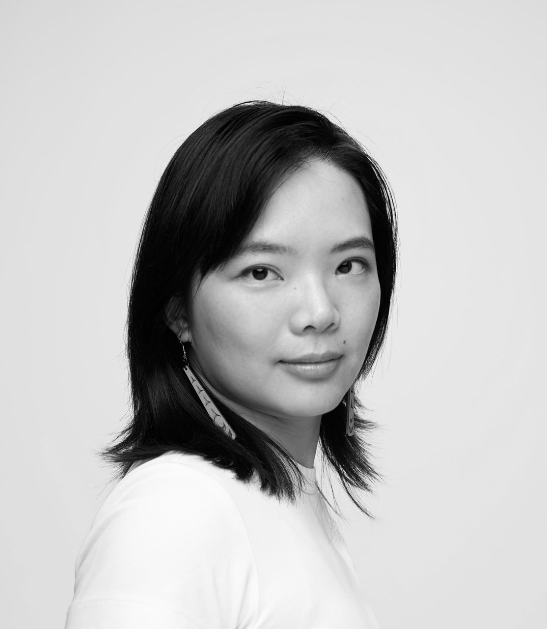
) is a Chinese-American graphic designer and illustrator, currently based in New York City. Having graduated from SVA with a BFA in illustration and RISD with an MFA in Graphic Design, Jo specializes in visual storytelling, bi-scriptual typography, and expressive systems. Her concept- and research-driven process takes form in visual identities, books, spaces, and websites. She maintains a teaching practice through adjunct teaching, mentorship and
Illustration Roundtable.
CLIENTS
The New Yorker, The New York Times, The Washington Post, The Wall Street Journal, Bloomberg Businessweek, NPR, Columbia Global Report, Medium, NBC, PLANSPONSOR, NYT for KIDS China, The Atlantic, Narratively, Toggl, Intel, FCB Inferno, Dotdash, The Balance, Thought Co., Lifewire, TripSavvy, The Spruce,
三联《少年》
,
新世相
FEATURES
It's Nice That, Groundooh Art, Hiiibrand
AWARDS
2022 - Society of Illustrators 65 Annual
2021 - Communication Arts 63 Winner
2020 - Hiiibrand Jury Award
2020 - American Illustration 39 Winner
2020 - Society of Illustrators Annual
2019 - Society of Illustrators Student Scholarship Competition Finalist
2019 - 3 x 3 International Illustration Award Merit Winner
2019 - The Batsford Prize International Category Shortlisted
2018 - Speedball New Impressions winner, Intaglio/Etching Second Place
EXHIBITIONS
2023 - eMotion, Ely Center of Contemporary Art, New Haven
2023 - Sino-German Illustration Exhibition, HISMOON gallery, Suzhou
2021 - NO SAMPLE Risograph Exhibition, Fujian
2021 - NO SAMPLE Risograph Exhibition, Xi'an
2019 - Society of Illustrators Student Scholarship, New York
2019 - Speedball National Printmaking Showcase, Davis Gallery, Sawtooth, NC
2018 - The Haves and Have-Nots, SVA Chelsea Gallery, New York 2018 - Constellations, SVA Chelsea Gallery, New York
2018 - HOPE Competition, SVA Westside Project Space, New York
COLOPHON
Web design
Jo Zixuan
Typeface
Authentic Sans by Christina Janus and Desmond Wong
Situated Sans by Thea Kim